Friday, 16 December 2011
Audience Research
I find that Kesha is a huge inspiration towards our genre and so looking at Twitter and face-book of Kesha's target Audience they are mainly teenage/young females ranging from 16-24. As she is different and likes to be herself, she can sometimes be outrageous and so the target audience can also be the ones who like to dress in different outfits to be individual.
I feel that advertising for this music video would be through the web 2.0 and through magazines. Although i feel that the main source of advertisement would definatly be through web 2.0 as this is where our teenaged targetted audience spend a lot of their time. With facebook, twitter and facebook a page on the video would get a lot of notice and they will be able to find out a lot about it and would hopefully appeal to them.
On our facebook page for the video we only have people in the age group from 16-24. Mainly Females with some males. We have had some feedback from the Digipak and Advertising poster to help us towards our target audience research.
James is a 20 year old student who is studying at university. He really liked the colour sceme and thought it was very striking and eye catching. He also really liked the design of it.
The critism he gave us was that he wasnt sure with what we were trying to portay through Molly's outfits as one is glamourous and the other is hiphop/edgy style.
We did this becuase we wanted to shoe the versitile side to our video as there is going to be many differnt shots with different styles. Like the getting ready and going out is glamourous and then the dance sections we want to be edgy and hip hop like.
Choreography
These Videos are examples that i have found on youtube which inspire us with what kind of dance/movememt we want.
They are both quick moving and the style of them are street/jazz.
When filming we will get shots of the girls and the male gaze so that the music video appeals to the male gender as well as the females.
Planning: Casting
This is our cast for the music video. They are all dancers and aspire to do this proffesionally in later years. Molly is the main focus to the video as the song is about her so she is going to be the cameras main subject. The other two girls are equally just as important but they wont have as much camera time but will portrayed as just as important.
| Harriet Morris Waitress 18 Years Old Dancer |
| Lotte Collins Employed 18 Years Old Dancer |
| Molly Andrews Bar Maid 18 Years Old Dancer |
Planning: Costumes and Props
For Costumes with the music video there are many different locations in which need different outfits!
For the going out scene i really like the idea of more casual outfits so that dancing in a club is easy and they can move more freely, but stereotypically girls would wear more revealing outfits that are tight fitted but classy at the same time!
For the going out scene i really like the idea of more casual outfits so that dancing in a club is easy and they can move more freely, but stereotypically girls would wear more revealing outfits that are tight fitted but classy at the same time!
For the getting ready scene i think they should be in pyjamas/dressing gown/casual clothes.
Then we have a dance scene where the routine will be performed outside. Thinking logically they need to be warm but look like dancers at the same time. I think casual clothes but able to dance in them. Although it will be very cold, we are thinking to dress them how we want and then take big coats/blankets to the set so they are comfortable and don't freeze.
Costume/Prop | Source | Potential cost | Person in charge |
Pyjamas | Provided - Amy’s Wardrobe | £0 | Amy |
Make up | Bringing their own | £0 | Charge of their own |
Dresses | Own Choice | £0 | In charge of their own |
Shoes/Heels/flats | Own | £0 | In charge of their own |
Dance wear | Own/Provided | £0 | Amy/Holly/own |
Coats | Amy’s house | £0 | Amy |
Blankets | Laura | £0 | Laura |
Tuesday, 22 November 2011
Friday, 11 November 2011
Wednesday, 9 November 2011
Print Research
Magazine Adverts
PLAN B's magazine advert
This is a magazine advert for PLAN B a UK artist.
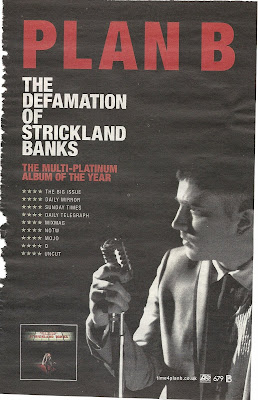 I find this advert very bold and eye grabbing because its easy to look at, there isn't much going on but enough for you to be interested! The black background isn't a jet black, its more of a worn black where it looks like its been there for years. This is what immediately grabbed my attention because I was thinking that it looked vintage! The red bold letters that say 'PLAN B' in capital letters also is very eye grabbing. This is so the audience knows who they are reading about (looking at) if they may not of seen him in person before.
I find that the red and white writing really stands out above the black/grey back ground and find it easy to read and interesting to look at. The font gradually decreases working down the page which is showing us what the most important part of the advert is and what's the most vital to read. Also as the font is decreasing the size of text is increasing which shows us where the most information is and some people would automatically read the small print after the 'PLAN B.'
The image of him is a side view which doesn't show all of his face, he is holding an old fashioned microphone which goes with the old vintage style of colours. He is in black and white which blends into the background which emphasises his star image as he is the main focus too the background because the lighting is coming from straight ahead emphasising a 'stage performance.'
There is an image in the bottom left hand corner of his album which is selling the product to the audience who is reading this magazine cover as well as selling him as a performer all together.
Rhianna's magazine advert
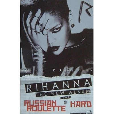 Rhinna's magazine advert is very bold, unique and completely different to her 'Loud' CD album! This is all in black and white apart from some writing at the bottom which is red! This whole advert comes across as being very emo and quite Gothic. This may because she wanted the audience to take her more seriously with this album compared to her last fun loving one. Showing variety of her talent and personality. When Rhianna released this album the trend was quite 'rock chick' as both genders would of got inspired by Rhianna her self.
The main image is of Rhianna with her hand across one half of her face only exposing the left side to her face, (looking at it would be our right) she has what looks like a metal hand/wrist garment which points up her index finger, attached to her other fingers! This is quite violent and comes across that she cant get it off becasue the look in her eyes show the audience different messages. She is staring straight into the camera which becomes more dominant as its awkward too look at. It could come across that she is the evil one, or it could come across as she is the victim. As her make up is done well and is very dramatic with her staring straight down the camera it comes across to me more of her being the dominant one!
The font is very bold and structured with not much text! This is so its easy to read and too look at, the red writing is what grabs your attention as it stands out from the rest of the advert! 'RHIANNA- THE NEW ALBUM FEAT &' has a black back ground to the white writing making it stand out more and so the audience know what the important parts to read are!
Ellie Goulding's magazine advert
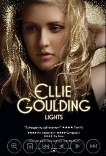 I find this one very effective as the detail into it is very simple but very effective. The bright, bold writing is large in the centre of the page saying her name and so this is straight away showing who the advert is advertising for, also the title of the CD they are advertising is in a smaller font underneath her name and so it is still one of the main focal points for the audience to look at. With the title being 'lights' the small scattered bright dots are representing lights because they are brighter than everything else and stand out from the image, there not real lights but they are they are bright and look really effective representing the theme of her album. The 'lights' being the same colour of the main font also is showing the representation towards the theme.
The top half of the page is a photo of Ellie Goulding her self posing in a natural, sensual way. Unlike Rhianna's advert she isn't facing directly to the camera and so is putting a more ease feel towards the advert. The lighting across her face is subtle, it is on her left hand side and so her right hand side is more shadowed and darker, this makes the 'lights' stand out more on our left hand side. The bottom half fades into darkness, and so it is black at the bottom, this is where there is smaller print writing of the advertisement of the star rating, company details, and reviews are.
I find the advert quite redundant as her music is quite indie and chilled and the advert is very subtle and easy to look at, the only entropy thing I find about it is that the title is 'lights' which doesn't represent her music, it may represent her as a person more but then that's not what is expected to see when judging the music by the title. I think it represents her as a person more, and so she comes across light hearted, bright, cheerful and fun loving.
I find that Magazine adverts have to have appropriate print work and have to be appealing to a wide range of the targeted audience. The style and theme they put across through the advert is advertising the music and so there advert is just as important as their tracks.
PLAN B's magazine advert
This is a magazine advert for PLAN B a UK artist.
 I find this advert very bold and eye grabbing because its easy to look at, there isn't much going on but enough for you to be interested! The black background isn't a jet black, its more of a worn black where it looks like its been there for years. This is what immediately grabbed my attention because I was thinking that it looked vintage! The red bold letters that say 'PLAN B' in capital letters also is very eye grabbing. This is so the audience knows who they are reading about (looking at) if they may not of seen him in person before.
I find that the red and white writing really stands out above the black/grey back ground and find it easy to read and interesting to look at. The font gradually decreases working down the page which is showing us what the most important part of the advert is and what's the most vital to read. Also as the font is decreasing the size of text is increasing which shows us where the most information is and some people would automatically read the small print after the 'PLAN B.'
The image of him is a side view which doesn't show all of his face, he is holding an old fashioned microphone which goes with the old vintage style of colours. He is in black and white which blends into the background which emphasises his star image as he is the main focus too the background because the lighting is coming from straight ahead emphasising a 'stage performance.'
There is an image in the bottom left hand corner of his album which is selling the product to the audience who is reading this magazine cover as well as selling him as a performer all together.
Rhianna's magazine advert
 Rhinna's magazine advert is very bold, unique and completely different to her 'Loud' CD album! This is all in black and white apart from some writing at the bottom which is red! This whole advert comes across as being very emo and quite Gothic. This may because she wanted the audience to take her more seriously with this album compared to her last fun loving one. Showing variety of her talent and personality. When Rhianna released this album the trend was quite 'rock chick' as both genders would of got inspired by Rhianna her self.
The main image is of Rhianna with her hand across one half of her face only exposing the left side to her face, (looking at it would be our right) she has what looks like a metal hand/wrist garment which points up her index finger, attached to her other fingers! This is quite violent and comes across that she cant get it off becasue the look in her eyes show the audience different messages. She is staring straight into the camera which becomes more dominant as its awkward too look at. It could come across that she is the evil one, or it could come across as she is the victim. As her make up is done well and is very dramatic with her staring straight down the camera it comes across to me more of her being the dominant one!
The font is very bold and structured with not much text! This is so its easy to read and too look at, the red writing is what grabs your attention as it stands out from the rest of the advert! 'RHIANNA- THE NEW ALBUM FEAT &' has a black back ground to the white writing making it stand out more and so the audience know what the important parts to read are!
Ellie Goulding's magazine advert
 I find this one very effective as the detail into it is very simple but very effective. The bright, bold writing is large in the centre of the page saying her name and so this is straight away showing who the advert is advertising for, also the title of the CD they are advertising is in a smaller font underneath her name and so it is still one of the main focal points for the audience to look at. With the title being 'lights' the small scattered bright dots are representing lights because they are brighter than everything else and stand out from the image, there not real lights but they are they are bright and look really effective representing the theme of her album. The 'lights' being the same colour of the main font also is showing the representation towards the theme.
The top half of the page is a photo of Ellie Goulding her self posing in a natural, sensual way. Unlike Rhianna's advert she isn't facing directly to the camera and so is putting a more ease feel towards the advert. The lighting across her face is subtle, it is on her left hand side and so her right hand side is more shadowed and darker, this makes the 'lights' stand out more on our left hand side. The bottom half fades into darkness, and so it is black at the bottom, this is where there is smaller print writing of the advertisement of the star rating, company details, and reviews are.
I find the advert quite redundant as her music is quite indie and chilled and the advert is very subtle and easy to look at, the only entropy thing I find about it is that the title is 'lights' which doesn't represent her music, it may represent her as a person more but then that's not what is expected to see when judging the music by the title. I think it represents her as a person more, and so she comes across light hearted, bright, cheerful and fun loving.
I find that Magazine adverts have to have appropriate print work and have to be appealing to a wide range of the targeted audience. The style and theme they put across through the advert is advertising the music and so there advert is just as important as their tracks.
Thursday, 3 November 2011
Print Research
Rhianna's Digipak
This is Rhianna's six fold 'Digipak' for her album 'LOUD'
I love this as it is really effective with the use of colours, The main colours we can see are red, skin colour and green. The colour red dominates the whole cover and creates the style to her music, also the roses in the bush matches the colour of her hair which creates a floral theme.
The front cover is a close up of Rhianna's face, the red lips and red hair creates the intention of love and involvement and also the close up tells the audience who the main feature and the star image is for this album, with her eyes are closed which shows a sense of vulnerability and subjection.
The CD its self is circular and has the image of a rose, entropy the rose isn't a bright vibrant red! Its a pale pink colour which is unexpected but shows a different side to Rhianna; being cool and calm but they still relate to the floral theme.
The rose's are obviously Rhianna's reinforcement too her star image. They recall many a times and relate to her work. Roses represent love and so the passion involved with her music, as she writes and sings mainly about love and relationships.
The font used on the CD cover is very spacious and simple. Its white and so it stands out from the image as there is no white in the photo.
The image on the inside is a picture of Rhianna lay across a bush of roses and this is spread across 3 pages of the CD this represents more of the rose style and the love theme. It also shows how one image can have such a big impact to the cover.
Kesha's Digipak
This is Kesha's 4 sided digipak for her album called animal + cannibal.
It looks quite dull with the black background colour but then there is many different colours, it also is a very glittery theme and the cold covers dominant the front cover. I find the colours are very interesting and unusual which makes it stand out to other items. The white, sketchy font stands out from the black background as it is such a high contrast to each other, this will help the audience to read the text more clearly and easily. There is quite a lot of text on back, middle and inside cover which looks very effective! It doesn't look like there is much to read, there is a lot of useful information on the back cover there is the list of all the songs in the album, the barcode, producers, label, copyright, marketing, promotions and price.
The outfits Kesha is wearing in the photos come across very rock chick but glamorous which in every page is a different outfit to show the varied sides to her and so it shows the audience her different personality's.
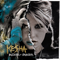 The front cover is a photograph with two very different sides to her, this is relating to the title 'animal/cannibal' as it is showing the viewers. It is showing that one side is relating to her animal side and the other is relating to her more human animal side. This is what makes her who she is, showing that she has different sides to her which she inst afraid of the audience seeing it because she is proud of who she is which then inspires younger generation to be themselves.
Also the rips that look like they have been sewn together are what makes the cover unique and different.
Kesha's Digipak
This is Kesha's 4 sided digipak for her album called animal + cannibal.
It looks quite dull with the black background colour but then there is many different colours, it also is a very glittery theme and the cold covers dominant the front cover. I find the colours are very interesting and unusual which makes it stand out to other items. The white, sketchy font stands out from the black background as it is such a high contrast to each other, this will help the audience to read the text more clearly and easily. There is quite a lot of text on back, middle and inside cover which looks very effective! It doesn't look like there is much to read, there is a lot of useful information on the back cover there is the list of all the songs in the album, the barcode, producers, label, copyright, marketing, promotions and price.
The outfits Kesha is wearing in the photos come across very rock chick but glamorous which in every page is a different outfit to show the varied sides to her and so it shows the audience her different personality's.
 The front cover is a photograph with two very different sides to her, this is relating to the title 'animal/cannibal' as it is showing the viewers. It is showing that one side is relating to her animal side and the other is relating to her more human animal side. This is what makes her who she is, showing that she has different sides to her which she inst afraid of the audience seeing it because she is proud of who she is which then inspires younger generation to be themselves.
Also the rips that look like they have been sewn together are what makes the cover unique and different.
Katy Perry's Digipak
Katy Perry's theme through out the whole the CD cover is to do with candy and fashion. The clouds image that cover the three pages are made to be like candy floss which is what it is in the music video and so relates to the Digipak. Included with the CD is a poster of Katy Perry posing with cakes which then again goes with the theme and boosts the interest for the CD as fans would get a poster of the star image and so this would may help boost sales.
The whole CD cover is pink, pink clouds, pink cakes, pink lipstick, pink CD swirls, pink font and also pink outfit. This is a very girl colour and relates to her music being about a girls life.
With all the sweet theme it relates to Katy Perry's personality being sweet and innocent which also tells the audience what kind of music she will be producing, it being more of a fun side and not so strict and formal.
Katy Perry being naked on the front cover with just the candy floss clouds covering her up would appeal to the opposite sex as well and the same sex with all the pink theme as males would find it quite provocative, and so I feel that it appeals to both genders and more of the mainstream audience.
The text is only mainly on the back cover of the digipak where it has the title list, bar-code, web links, producers, copyright label and bonus tracks. There isn't any writing on the front or inside cover as I think she wanted to produce a more fashion illustrated kind of CD case which influences the audience.
I find this CD cover to be very redundant as the same theme is produced on every page and there isn't a different theme and so it is quite predictable to what Katy Perry's songs will be like.
I find that having appropriate print work is very vital towards the overall look for the artist and the company. Although now a days we tend to buy music for MP3's through itunes etc so there isn't always an image with it. I would say with itunes and downloading music- most of them would have the album cover shown so that the audience recognize the cover and be able to buy the album in confidence.
In a shop such as HMV print work is very important as I find that there are so many album covers that the one that stands out would grab your attention, even looking for a CD that you know you want must have good print work as it shows the audience the detail and elements gone into making it knowing that it will be good standard CD.
Tuesday, 1 November 2011
Andrew Goodwin
Andrew Goodwins theory has 5 main key points to it that you should be able to 'see the sound, there should be a narrative and a performance, there should be a star image, it should relate to the visuals of the song and there should be technical aspects to the music video.
The three main aspects to a music video are visual, amplifying and disjunctive.
Here is an image I found on 'www.google.com' which is a mind map of Andrew Goodwin's Theory. It is a mind map and so it looks like it has been done by a student who is learning about Goodwin's theory.
The three main aspects to a music video are visual, amplifying and disjunctive.
Here is an image I found on 'www.google.com' which is a mind map of Andrew Goodwin's Theory. It is a mind map and so it looks like it has been done by a student who is learning about Goodwin's theory.
Thursday, 13 October 2011
Casting
Wednesday, 12 October 2011
Pitches
We created a pitch through Prezi and also we did mood board for our music video. This is so it will be more interesting to the viewers and we can get constructive feedback from them to make our appeal to mo
Summary of feedback from the 'Pitch'
All together the Pitch feedback we received from the rest of the class was mainly quite positive. They seemed to enjoy it and followed our idea really well.
A main concern by all was 'how will you be able to film in a club?' We already discussed this and came up with the solution of filming by a hand held camera so we get the effect of being in the party, and it looks like the audience will be a part of it.
Comments on suitability for target audience; Very suitable, suits the audience and fits well.
Comments on the originality of the idea; Most people thought that it is quite an original idea, that it has been done before but will look really effective.
Comments on the logistical arrangements; here is where most people were concerned about how we will come about filming in 'bushwackers.' - We have came up with the solution for this.
Comments on the technical aspects of the idea; Feedback on this was mainly quite positive and they agreed that college has equipment to film our video but some are concerned about lighting and whether it will be bright enough to see without college lighting.
Does the idea sound realistic?; They all feel that the idea is very good and they think that it could work if the effort of filming is put in. If something goes wrong which it easily could then it could all go drastically wrong but if the effort of filming and editing is put in then everyone thinks that it could be a very good music video!
Friday, 7 October 2011
Creativity
Creativity is using your imagination to create things whether it is choreography or art work. I find inspiration helps towards using your own imagination because it gives you idea's without necessarily copying someone else's work. It also gives people the opportunity to express their talents and feelings through creating things. I say 'creating things' because 'creating' is mainly doing something practical and doing what you imagine or see in your artistic part of your mind.
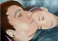 I have experienced using creativity many a times as I am a art student where we get to draw what we see, paint what we feel and use the imagination to create something wonderful. Here is an example of one of my drawings where I have used creativity. This is a painting i did last year, i got my inspiration from the theme of 'sleeping' and so got two of my friends to model as if they were sleeping and i took photos and then drew and painted from them.
 Another time where I experience creativity is at my dance school where we use imagination and feelings to 'dance' We get the chance to make routines up where we use our creative side to do so.
This week we have been using our lesson time to get the most use out of creating things and being as practical as we can to get idea's for our music video.
Me and my friend already knew a dance routine, it was one that we did a while ago in a jazz class which we take part in every week at our dance school and so this helped us with inspiration towards our product.
The song we are using has a good rhythm to have a dance routine in it and so we videoed a dance routine and some shots that would be ideal for our idea. The song we used for our 'idea's' is not the song we are going to be using but it is quite similar in the style of it and the genre.
Here is what we have been up to this week...
Tuesday, 4 October 2011
Friday, 30 September 2011
Music Video Research - Disjunctive
Fat Boy Slim - Praise You
This music video was directed by Spike Jonze; It is produced by 'Fat boy slim' and was released in 1999.
The video is disjunctive as the video doesn't fit with the lyrics to the song and so it doesn't fit in with Goodwin's theory. They have done a dance routine, but the they haven't done it so that it fits to the lyrics but it fits to the rhythm of the music. According to Goodwin the relationship between the lyrics of the song and the actual video footage should have some sort of link. Here the lyrics 'I have to praise you, I have to praise you like I should,' this doesn't show that someone is praising another person as it is people in what looks like a local area dancing to the music. Its more like celebrating for something all together. The dance moves fit to the beats of the music but doesn't have anything to do with the lyrics. The video was shot guerrilla-style (this is not obtaining permission at the location) outside an old movie theatre.
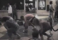 The genre of the video is 'alternative rock and big beat.'
You don't see the producers in the video we can just hear them, so there isn't any representation of the artist apart from what we hear.
I would say that there isn't much of a narrative to it, as there isn't a story in which we follow! All we see is a group dancing a routine to the music. It also looks like a home video, as in it looks like someone is hand holding the camera in which I think gives the idea of being a video that someone has recorded it on the sly and its funny and amusing to watch because its as if its the only footage.
Everyone is dressed in casual clothes which emphasises the fact that its done on a one off and the whole arrangement has the idea of funny and done for peoples entertainment.
Calvin Harris - I'm not alone
This video does not match the resemblance of the lyrics, the genre is electric pop but the video doesn't portray this for the audience to see.
The first shot we see is of a boy pulling a sledge through the snow with a teddy on it. This isn't relating to the lyrics 'Can you stay up for the weekend And blame god for looking too old' as this is putting a storyline behind the music lyrics. So we are watching and listening to two different things. When the music gets a rhythm and a beat starts to kick in the boys moves in time with the music and looks quite scared as he is in the woods on his own in a forest. He starts getting frantic, trying to walk fast in the deep snow as the music is building up which builds suspense to the viewers. When it builds up to a climax the girls start to dance in their chairs/cells with Calvin Harris there. They are dancing to the beat, and it makes people want to get up and dance because of the electric pop genre.
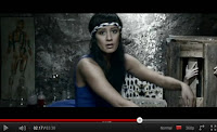 As I have said there inst much of a story line that follows the lyrics but what we see is women inside a castle inside a dark dingy room with Calvin Harris in a surgery jacket torturing them. There is about 10 women around the room doing static movements which emphasises Calvin Harris to main the star representation as he is the only male there. It looks like they are all idolising him and at one point he ties a girl down and sharpens his knife. He goes around the room measuring the girls with a tape measure, They are all dancing quickly as if they cant stop. It is quite strange. Harris is seen to be a Frankenstein type character by performing experiments on females to take his anger out on his lost 'teddy' that he lost in snow when he was a little boy.
This is all representing Calving Harris as the 'star' image as there is many close ups and the focus is on him and what he is doing to the females. He is represented to be a character like Frankenstein, we can see this through the shots we see of the women around him practically being possessed and poisoned.
This is a disjunctive video as relating to Goodwin's theory the visuals do not match the lyrics and so there for it is a disjunctive music video.
This music video was directed by Spike Jonze; It is produced by 'Fat boy slim' and was released in 1999.
The video is disjunctive as the video doesn't fit with the lyrics to the song and so it doesn't fit in with Goodwin's theory. They have done a dance routine, but the they haven't done it so that it fits to the lyrics but it fits to the rhythm of the music. According to Goodwin the relationship between the lyrics of the song and the actual video footage should have some sort of link. Here the lyrics 'I have to praise you, I have to praise you like I should,' this doesn't show that someone is praising another person as it is people in what looks like a local area dancing to the music. Its more like celebrating for something all together. The dance moves fit to the beats of the music but doesn't have anything to do with the lyrics. The video was shot guerrilla-style (this is not obtaining permission at the location) outside an old movie theatre.
 The genre of the video is 'alternative rock and big beat.'
You don't see the producers in the video we can just hear them, so there isn't any representation of the artist apart from what we hear.
I would say that there isn't much of a narrative to it, as there isn't a story in which we follow! All we see is a group dancing a routine to the music. It also looks like a home video, as in it looks like someone is hand holding the camera in which I think gives the idea of being a video that someone has recorded it on the sly and its funny and amusing to watch because its as if its the only footage.
Everyone is dressed in casual clothes which emphasises the fact that its done on a one off and the whole arrangement has the idea of funny and done for peoples entertainment.
Calvin Harris - I'm not alone
This video does not match the resemblance of the lyrics, the genre is electric pop but the video doesn't portray this for the audience to see.
The first shot we see is of a boy pulling a sledge through the snow with a teddy on it. This isn't relating to the lyrics 'Can you stay up for the weekend And blame god for looking too old' as this is putting a storyline behind the music lyrics. So we are watching and listening to two different things. When the music gets a rhythm and a beat starts to kick in the boys moves in time with the music and looks quite scared as he is in the woods on his own in a forest. He starts getting frantic, trying to walk fast in the deep snow as the music is building up which builds suspense to the viewers. When it builds up to a climax the girls start to dance in their chairs/cells with Calvin Harris there. They are dancing to the beat, and it makes people want to get up and dance because of the electric pop genre.
 As I have said there inst much of a story line that follows the lyrics but what we see is women inside a castle inside a dark dingy room with Calvin Harris in a surgery jacket torturing them. There is about 10 women around the room doing static movements which emphasises Calvin Harris to main the star representation as he is the only male there. It looks like they are all idolising him and at one point he ties a girl down and sharpens his knife. He goes around the room measuring the girls with a tape measure, They are all dancing quickly as if they cant stop. It is quite strange. Harris is seen to be a Frankenstein type character by performing experiments on females to take his anger out on his lost 'teddy' that he lost in snow when he was a little boy.
 This is all representing Calving Harris as the 'star' image as there is many close ups and the focus is on him and what he is doing to the females. He is represented to be a character like Frankenstein, we can see this through the shots we see of the women around him practically being possessed and poisoned.
This is a disjunctive video as relating to Goodwin's theory the visuals do not match the lyrics and so there for it is a disjunctive music video.
Tuesday, 27 September 2011
Music Video Research
Beyonce Knowles - Run the world
The verses, choruses and the bridges are all laid out equally. There are three choruses, the song starts off with short phrase which is repeated through out the song, this is where the set and cast are being introduced to the visuals.
 It then goes straight into the Chorus which is repeated three times throughout the video. This is the main source and its where the most busy times are in the video, with dance breaks and lots of bodies you can see that this is the chorus as there is a pattern of the same images through out the chorus.
The music fits with the video really well, the dance is fitted to fit with the beats of the music and so it looks more effective. Also Beyonce sings when she dances which is inspiring to the viewers and so the sounds have been made to be visual. We see that Goodwin suggests that visuals in music videos respond to the pace of music.
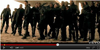
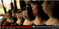 The song is about 'girls' running the world. The way they follow this is having an army of girls, there inst a set story but we see that its girls proving to the men that they are taking over, by being in a group and over powering the males. They are in formed lines and patterns of what an army would look like where the men are stood in more of a clump, this shows how the women are dominating them in an organised fashion.
We don't see how this army was bought on and what the reasons were for having a war against the two genders. This is because I think she wanted it to be more stereotypical and so that the female audience would automatically like this song because of the role of Beyonce.
Beyonce is portraying the leader of the female group and so with loads of close ups we see that she is the dominant figure and the 'star' to the female army.
She is represented as being beautiful with an amazing figure! This is so that we idolize her and look up to her as being the stereotypical pop star.
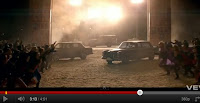 There is dramatic lighting used to create the effects of the set, also the use of fog and steam to create the intense atmosphere of the deserted barn conversion they are in. They have put the lights high up so that it looks like the sun beaming through the cracks of the barn.
The mise-en-scene they have used is in a worn out barn/factory to create a tense atmosphere so that it makes us think that they have come for a battle, with the outfits being quite formal for the men (all black) and then the women being in desert/cave girl outfits which show the viewers that the story to this is that the women are over powering as they look like they are quite rough and we feel a sense of dominance. This is also due to the camera angles we see. There ins't many that are shot of the males. The male shots are either from behind/side or on an angle where as the women have shots from different angles, high view, low view, from the side but mainly from head on which shows their importance. Also we can see that the women are the most dominant as they are moving around more and the shots taken of the girls are from many different angles which are fast moving where as the men don't really move around and so their shots are more slow paced decreasing their importance.

I don't think that this video is very literal. As you don't see every day male and female's having dance battles with each other in the middle of know where. I feel that it has been portrayed really well and the idea comes across about what its about but we know that its not really but fantasy.
Bruno Mars - The Lazy Song
The structure of the song starts of with a chorus, this is so the visuals realises and so it becomes known when it comes on in the song after a verse. At the end there is a bridge before the final chorus this is when in the video we see that its coming to an end because they start doing different things to what they were doing when the chorus and the verses.
The sounds have been made to be very visual as they have certain movements to each line of the chorus this is so that the visuals respond to the movements and relate to this when they hear the song.
Goodwin suggested that the relationship between the lyrics and the visuals, with the lyrics being amplified, illustrated or contradicting the lyrics.
With this music video we see that the visuals have illustrated the lyrics by the movement involved.
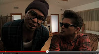 I don't feel that this video is telling us a story. I can't follow any story line within the theme and actions of the characters. There is five monkeys and Bruno Mars in what looks like a bedroom. At one point a man comes on as if its his bedroom but then sings a women's line. It is all very strange but the actions that are put with the song are very clever and easy to learn so that its a well know dance routine. This is word or scene links because he is dancing about what he is singing. Its more of a fun video where there isn't a set narrative to follow this makes the visuals feel relaxed and easy to watch as you don't have to follow with what's going with different sets/costumes/characters etc.
 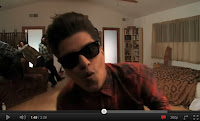 Bruno Mars himself is the main character and star image as we can tell through the shots of the camera. The camera stays still through out the whole video but the characters come close to it when singing and when their dancing they will use the whole frame.
 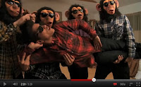 We understand that Bruno Mars is the main character as he isn't wearing a monkey mask like the other five. I think this is to illustrate that he is the main star and the others are extras.
There isn't any different camera shots apart from the camera staying still at mid view level. I think they have done this because it is highly effective and its as if they are recording them selves just messing around in a bedroom. This is an amplifying music video where they are echoing the mood of the music; It being light hearted and fun.
Subscribe to:
Comments (Atom)


