Rhianna's Digipak
This is Rhianna's six fold 'Digipak' for her album 'LOUD'
I love this as it is really effective with the use of colours, The main colours we can see are red, skin colour and green. The colour red dominates the whole cover and creates the style to her music, also the roses in the bush matches the colour of her hair which creates a floral theme.
The front cover is a close up of Rhianna's face, the red lips and red hair creates the intention of love and involvement and also the close up tells the audience who the main feature and the star image is for this album, with her eyes are closed which shows a sense of vulnerability and subjection.
The CD its self is circular and has the image of a rose, entropy the rose isn't a bright vibrant red! Its a pale pink colour which is unexpected but shows a different side to Rhianna; being cool and calm but they still relate to the floral theme.
The rose's are obviously Rhianna's reinforcement too her star image. They recall many a times and relate to her work. Roses represent love and so the passion involved with her music, as she writes and sings mainly about love and relationships.
The font used on the CD cover is very spacious and simple. Its white and so it stands out from the image as there is no white in the photo.
The image on the inside is a picture of Rhianna lay across a bush of roses and this is spread across 3 pages of the CD this represents more of the rose style and the love theme. It also shows how one image can have such a big impact to the cover.
Kesha's Digipak
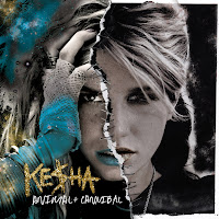
This is Kesha's 4 sided digipak for her album called animal + cannibal.
It looks quite dull with the black background colour but then there is many different colours, it also is a very glittery theme and the cold covers dominant the front cover. I find the colours are very interesting and unusual which makes it stand out to other items. The white, sketchy font stands out from the black background as it is such a high contrast to each other, this will help the audience to read the text more clearly and easily. There is quite a lot of text on back, middle and inside cover which looks very effective! It doesn't look like there is much to read, there is a lot of useful information on the back cover there is the list of all the songs in the album, the barcode, producers, label, copyright, marketing, promotions and price.
The outfits Kesha is wearing in the photos come across very rock chick but glamorous which in every page is a different outfit to show the varied sides to her and so it shows the audience her different personality's.
 The front cover is a photograph with two very different sides to her, this is relating to the title 'animal/cannibal' as it is showing the viewers. It is showing that one side is relating to her animal side and the other is relating to her more human animal side. This is what makes her who she is, showing that she has different sides to her which she inst afraid of the audience seeing it because she is proud of who she is which then inspires younger generation to be themselves.
Also the rips that look like they have been sewn together are what makes the cover unique and different.
Kesha's Digipak
This is Kesha's 4 sided digipak for her album called animal + cannibal.
It looks quite dull with the black background colour but then there is many different colours, it also is a very glittery theme and the cold covers dominant the front cover. I find the colours are very interesting and unusual which makes it stand out to other items. The white, sketchy font stands out from the black background as it is such a high contrast to each other, this will help the audience to read the text more clearly and easily. There is quite a lot of text on back, middle and inside cover which looks very effective! It doesn't look like there is much to read, there is a lot of useful information on the back cover there is the list of all the songs in the album, the barcode, producers, label, copyright, marketing, promotions and price.
The outfits Kesha is wearing in the photos come across very rock chick but glamorous which in every page is a different outfit to show the varied sides to her and so it shows the audience her different personality's.
 The front cover is a photograph with two very different sides to her, this is relating to the title 'animal/cannibal' as it is showing the viewers. It is showing that one side is relating to her animal side and the other is relating to her more human animal side. This is what makes her who she is, showing that she has different sides to her which she inst afraid of the audience seeing it because she is proud of who she is which then inspires younger generation to be themselves.
Also the rips that look like they have been sewn together are what makes the cover unique and different.
Katy Perry's Digipak
Katy Perry's theme through out the whole the CD cover is to do with candy and fashion. The clouds image that cover the three pages are made to be like candy floss which is what it is in the music video and so relates to the Digipak. Included with the CD is a poster of Katy Perry posing with cakes which then again goes with the theme and boosts the interest for the CD as fans would get a poster of the star image and so this would may help boost sales.
The whole CD cover is pink, pink clouds, pink cakes, pink lipstick, pink CD swirls, pink font and also pink outfit. This is a very girl colour and relates to her music being about a girls life.
With all the sweet theme it relates to Katy Perry's personality being sweet and innocent which also tells the audience what kind of music she will be producing, it being more of a fun side and not so strict and formal.
Katy Perry being naked on the front cover with just the candy floss clouds covering her up would appeal to the opposite sex as well and the same sex with all the pink theme as males would find it quite provocative, and so I feel that it appeals to both genders and more of the mainstream audience.
The text is only mainly on the back cover of the digipak where it has the title list, bar-code, web links, producers, copyright label and bonus tracks. There isn't any writing on the front or inside cover as I think she wanted to produce a more fashion illustrated kind of CD case which influences the audience.
I find this CD cover to be very redundant as the same theme is produced on every page and there isn't a different theme and so it is quite predictable to what Katy Perry's songs will be like.
I find that having appropriate print work is very vital towards the overall look for the artist and the company. Although now a days we tend to buy music for MP3's through itunes etc so there isn't always an image with it. I would say with itunes and downloading music- most of them would have the album cover shown so that the audience recognize the cover and be able to buy the album in confidence.
In a shop such as HMV print work is very important as I find that there are so many album covers that the one that stands out would grab your attention, even looking for a CD that you know you want must have good print work as it shows the audience the detail and elements gone into making it knowing that it will be good standard CD.


No comments:
Post a Comment