PLAN B's magazine advert
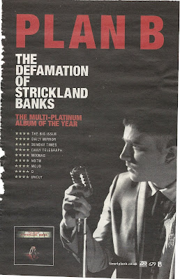
This is a magazine advert for PLAN B a UK artist.
 I find this advert very bold and eye grabbing because its easy to look at, there isn't much going on but enough for you to be interested! The black background isn't a jet black, its more of a worn black where it looks like its been there for years. This is what immediately grabbed my attention because I was thinking that it looked vintage! The red bold letters that say 'PLAN B' in capital letters also is very eye grabbing. This is so the audience knows who they are reading about (looking at) if they may not of seen him in person before.
I find that the red and white writing really stands out above the black/grey back ground and find it easy to read and interesting to look at. The font gradually decreases working down the page which is showing us what the most important part of the advert is and what's the most vital to read. Also as the font is decreasing the size of text is increasing which shows us where the most information is and some people would automatically read the small print after the 'PLAN B.'
The image of him is a side view which doesn't show all of his face, he is holding an old fashioned microphone which goes with the old vintage style of colours. He is in black and white which blends into the background which emphasises his star image as he is the main focus too the background because the lighting is coming from straight ahead emphasising a 'stage performance.'
There is an image in the bottom left hand corner of his album which is selling the product to the audience who is reading this magazine cover as well as selling him as a performer all together.
Rhianna's magazine advert
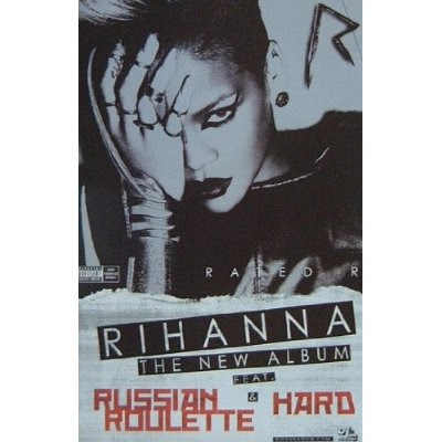
 Rhinna's magazine advert is very bold, unique and completely different to her 'Loud' CD album! This is all in black and white apart from some writing at the bottom which is red! This whole advert comes across as being very emo and quite Gothic. This may because she wanted the audience to take her more seriously with this album compared to her last fun loving one. Showing variety of her talent and personality. When Rhianna released this album the trend was quite 'rock chick' as both genders would of got inspired by Rhianna her self.
The main image is of Rhianna with her hand across one half of her face only exposing the left side to her face, (looking at it would be our right) she has what looks like a metal hand/wrist garment which points up her index finger, attached to her other fingers! This is quite violent and comes across that she cant get it off becasue the look in her eyes show the audience different messages. She is staring straight into the camera which becomes more dominant as its awkward too look at. It could come across that she is the evil one, or it could come across as she is the victim. As her make up is done well and is very dramatic with her staring straight down the camera it comes across to me more of her being the dominant one!
The font is very bold and structured with not much text! This is so its easy to read and too look at, the red writing is what grabs your attention as it stands out from the rest of the advert! 'RHIANNA- THE NEW ALBUM FEAT &' has a black back ground to the white writing making it stand out more and so the audience know what the important parts to read are!
Ellie Goulding's magazine advert
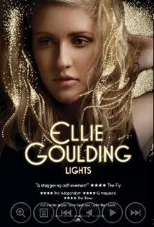
 I find this one very effective as the detail into it is very simple but very effective. The bright, bold writing is large in the centre of the page saying her name and so this is straight away showing who the advert is advertising for, also the title of the CD they are advertising is in a smaller font underneath her name and so it is still one of the main focal points for the audience to look at. With the title being 'lights' the small scattered bright dots are representing lights because they are brighter than everything else and stand out from the image, there not real lights but they are they are bright and look really effective representing the theme of her album. The 'lights' being the same colour of the main font also is showing the representation towards the theme.
The top half of the page is a photo of Ellie Goulding her self posing in a natural, sensual way. Unlike Rhianna's advert she isn't facing directly to the camera and so is putting a more ease feel towards the advert. The lighting across her face is subtle, it is on her left hand side and so her right hand side is more shadowed and darker, this makes the 'lights' stand out more on our left hand side. The bottom half fades into darkness, and so it is black at the bottom, this is where there is smaller print writing of the advertisement of the star rating, company details, and reviews are.
I find the advert quite redundant as her music is quite indie and chilled and the advert is very subtle and easy to look at, the only entropy thing I find about it is that the title is 'lights' which doesn't represent her music, it may represent her as a person more but then that's not what is expected to see when judging the music by the title. I think it represents her as a person more, and so she comes across light hearted, bright, cheerful and fun loving.
I find that Magazine adverts have to have appropriate print work and have to be appealing to a wide range of the targeted audience. The style and theme they put across through the advert is advertising the music and so there advert is just as important as their tracks.
No comments:
Post a Comment