Tuesday, 22 November 2011
Friday, 11 November 2011
Wednesday, 9 November 2011
Print Research
Magazine Adverts
PLAN B's magazine advert
This is a magazine advert for PLAN B a UK artist.
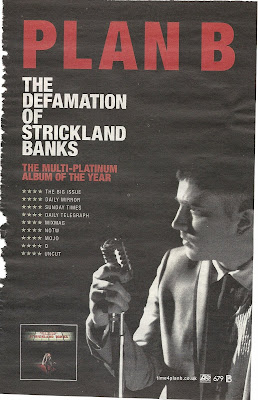 I find this advert very bold and eye grabbing because its easy to look at, there isn't much going on but enough for you to be interested! The black background isn't a jet black, its more of a worn black where it looks like its been there for years. This is what immediately grabbed my attention because I was thinking that it looked vintage! The red bold letters that say 'PLAN B' in capital letters also is very eye grabbing. This is so the audience knows who they are reading about (looking at) if they may not of seen him in person before.
I find that the red and white writing really stands out above the black/grey back ground and find it easy to read and interesting to look at. The font gradually decreases working down the page which is showing us what the most important part of the advert is and what's the most vital to read. Also as the font is decreasing the size of text is increasing which shows us where the most information is and some people would automatically read the small print after the 'PLAN B.'
The image of him is a side view which doesn't show all of his face, he is holding an old fashioned microphone which goes with the old vintage style of colours. He is in black and white which blends into the background which emphasises his star image as he is the main focus too the background because the lighting is coming from straight ahead emphasising a 'stage performance.'
There is an image in the bottom left hand corner of his album which is selling the product to the audience who is reading this magazine cover as well as selling him as a performer all together.
Rhianna's magazine advert
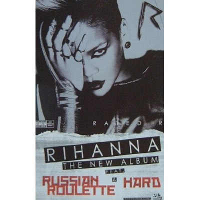 Rhinna's magazine advert is very bold, unique and completely different to her 'Loud' CD album! This is all in black and white apart from some writing at the bottom which is red! This whole advert comes across as being very emo and quite Gothic. This may because she wanted the audience to take her more seriously with this album compared to her last fun loving one. Showing variety of her talent and personality. When Rhianna released this album the trend was quite 'rock chick' as both genders would of got inspired by Rhianna her self.
The main image is of Rhianna with her hand across one half of her face only exposing the left side to her face, (looking at it would be our right) she has what looks like a metal hand/wrist garment which points up her index finger, attached to her other fingers! This is quite violent and comes across that she cant get it off becasue the look in her eyes show the audience different messages. She is staring straight into the camera which becomes more dominant as its awkward too look at. It could come across that she is the evil one, or it could come across as she is the victim. As her make up is done well and is very dramatic with her staring straight down the camera it comes across to me more of her being the dominant one!
The font is very bold and structured with not much text! This is so its easy to read and too look at, the red writing is what grabs your attention as it stands out from the rest of the advert! 'RHIANNA- THE NEW ALBUM FEAT &' has a black back ground to the white writing making it stand out more and so the audience know what the important parts to read are!
Ellie Goulding's magazine advert
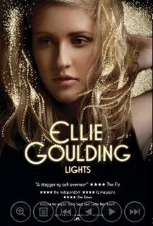 I find this one very effective as the detail into it is very simple but very effective. The bright, bold writing is large in the centre of the page saying her name and so this is straight away showing who the advert is advertising for, also the title of the CD they are advertising is in a smaller font underneath her name and so it is still one of the main focal points for the audience to look at. With the title being 'lights' the small scattered bright dots are representing lights because they are brighter than everything else and stand out from the image, there not real lights but they are they are bright and look really effective representing the theme of her album. The 'lights' being the same colour of the main font also is showing the representation towards the theme.
The top half of the page is a photo of Ellie Goulding her self posing in a natural, sensual way. Unlike Rhianna's advert she isn't facing directly to the camera and so is putting a more ease feel towards the advert. The lighting across her face is subtle, it is on her left hand side and so her right hand side is more shadowed and darker, this makes the 'lights' stand out more on our left hand side. The bottom half fades into darkness, and so it is black at the bottom, this is where there is smaller print writing of the advertisement of the star rating, company details, and reviews are.
I find the advert quite redundant as her music is quite indie and chilled and the advert is very subtle and easy to look at, the only entropy thing I find about it is that the title is 'lights' which doesn't represent her music, it may represent her as a person more but then that's not what is expected to see when judging the music by the title. I think it represents her as a person more, and so she comes across light hearted, bright, cheerful and fun loving.
I find that Magazine adverts have to have appropriate print work and have to be appealing to a wide range of the targeted audience. The style and theme they put across through the advert is advertising the music and so there advert is just as important as their tracks.
PLAN B's magazine advert
This is a magazine advert for PLAN B a UK artist.
 I find this advert very bold and eye grabbing because its easy to look at, there isn't much going on but enough for you to be interested! The black background isn't a jet black, its more of a worn black where it looks like its been there for years. This is what immediately grabbed my attention because I was thinking that it looked vintage! The red bold letters that say 'PLAN B' in capital letters also is very eye grabbing. This is so the audience knows who they are reading about (looking at) if they may not of seen him in person before.
I find that the red and white writing really stands out above the black/grey back ground and find it easy to read and interesting to look at. The font gradually decreases working down the page which is showing us what the most important part of the advert is and what's the most vital to read. Also as the font is decreasing the size of text is increasing which shows us where the most information is and some people would automatically read the small print after the 'PLAN B.'
The image of him is a side view which doesn't show all of his face, he is holding an old fashioned microphone which goes with the old vintage style of colours. He is in black and white which blends into the background which emphasises his star image as he is the main focus too the background because the lighting is coming from straight ahead emphasising a 'stage performance.'
There is an image in the bottom left hand corner of his album which is selling the product to the audience who is reading this magazine cover as well as selling him as a performer all together.
Rhianna's magazine advert
 Rhinna's magazine advert is very bold, unique and completely different to her 'Loud' CD album! This is all in black and white apart from some writing at the bottom which is red! This whole advert comes across as being very emo and quite Gothic. This may because she wanted the audience to take her more seriously with this album compared to her last fun loving one. Showing variety of her talent and personality. When Rhianna released this album the trend was quite 'rock chick' as both genders would of got inspired by Rhianna her self.
The main image is of Rhianna with her hand across one half of her face only exposing the left side to her face, (looking at it would be our right) she has what looks like a metal hand/wrist garment which points up her index finger, attached to her other fingers! This is quite violent and comes across that she cant get it off becasue the look in her eyes show the audience different messages. She is staring straight into the camera which becomes more dominant as its awkward too look at. It could come across that she is the evil one, or it could come across as she is the victim. As her make up is done well and is very dramatic with her staring straight down the camera it comes across to me more of her being the dominant one!
The font is very bold and structured with not much text! This is so its easy to read and too look at, the red writing is what grabs your attention as it stands out from the rest of the advert! 'RHIANNA- THE NEW ALBUM FEAT &' has a black back ground to the white writing making it stand out more and so the audience know what the important parts to read are!
Ellie Goulding's magazine advert
 I find this one very effective as the detail into it is very simple but very effective. The bright, bold writing is large in the centre of the page saying her name and so this is straight away showing who the advert is advertising for, also the title of the CD they are advertising is in a smaller font underneath her name and so it is still one of the main focal points for the audience to look at. With the title being 'lights' the small scattered bright dots are representing lights because they are brighter than everything else and stand out from the image, there not real lights but they are they are bright and look really effective representing the theme of her album. The 'lights' being the same colour of the main font also is showing the representation towards the theme.
The top half of the page is a photo of Ellie Goulding her self posing in a natural, sensual way. Unlike Rhianna's advert she isn't facing directly to the camera and so is putting a more ease feel towards the advert. The lighting across her face is subtle, it is on her left hand side and so her right hand side is more shadowed and darker, this makes the 'lights' stand out more on our left hand side. The bottom half fades into darkness, and so it is black at the bottom, this is where there is smaller print writing of the advertisement of the star rating, company details, and reviews are.
I find the advert quite redundant as her music is quite indie and chilled and the advert is very subtle and easy to look at, the only entropy thing I find about it is that the title is 'lights' which doesn't represent her music, it may represent her as a person more but then that's not what is expected to see when judging the music by the title. I think it represents her as a person more, and so she comes across light hearted, bright, cheerful and fun loving.
I find that Magazine adverts have to have appropriate print work and have to be appealing to a wide range of the targeted audience. The style and theme they put across through the advert is advertising the music and so there advert is just as important as their tracks.
Thursday, 3 November 2011
Print Research
Rhianna's Digipak
This is Rhianna's six fold 'Digipak' for her album 'LOUD'
I love this as it is really effective with the use of colours, The main colours we can see are red, skin colour and green. The colour red dominates the whole cover and creates the style to her music, also the roses in the bush matches the colour of her hair which creates a floral theme.
The front cover is a close up of Rhianna's face, the red lips and red hair creates the intention of love and involvement and also the close up tells the audience who the main feature and the star image is for this album, with her eyes are closed which shows a sense of vulnerability and subjection.
The CD its self is circular and has the image of a rose, entropy the rose isn't a bright vibrant red! Its a pale pink colour which is unexpected but shows a different side to Rhianna; being cool and calm but they still relate to the floral theme.
The rose's are obviously Rhianna's reinforcement too her star image. They recall many a times and relate to her work. Roses represent love and so the passion involved with her music, as she writes and sings mainly about love and relationships.
The font used on the CD cover is very spacious and simple. Its white and so it stands out from the image as there is no white in the photo.
The image on the inside is a picture of Rhianna lay across a bush of roses and this is spread across 3 pages of the CD this represents more of the rose style and the love theme. It also shows how one image can have such a big impact to the cover.
Kesha's Digipak
This is Kesha's 4 sided digipak for her album called animal + cannibal.
It looks quite dull with the black background colour but then there is many different colours, it also is a very glittery theme and the cold covers dominant the front cover. I find the colours are very interesting and unusual which makes it stand out to other items. The white, sketchy font stands out from the black background as it is such a high contrast to each other, this will help the audience to read the text more clearly and easily. There is quite a lot of text on back, middle and inside cover which looks very effective! It doesn't look like there is much to read, there is a lot of useful information on the back cover there is the list of all the songs in the album, the barcode, producers, label, copyright, marketing, promotions and price.
The outfits Kesha is wearing in the photos come across very rock chick but glamorous which in every page is a different outfit to show the varied sides to her and so it shows the audience her different personality's.
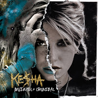 The front cover is a photograph with two very different sides to her, this is relating to the title 'animal/cannibal' as it is showing the viewers. It is showing that one side is relating to her animal side and the other is relating to her more human animal side. This is what makes her who she is, showing that she has different sides to her which she inst afraid of the audience seeing it because she is proud of who she is which then inspires younger generation to be themselves.
Also the rips that look like they have been sewn together are what makes the cover unique and different.
Kesha's Digipak
This is Kesha's 4 sided digipak for her album called animal + cannibal.
It looks quite dull with the black background colour but then there is many different colours, it also is a very glittery theme and the cold covers dominant the front cover. I find the colours are very interesting and unusual which makes it stand out to other items. The white, sketchy font stands out from the black background as it is such a high contrast to each other, this will help the audience to read the text more clearly and easily. There is quite a lot of text on back, middle and inside cover which looks very effective! It doesn't look like there is much to read, there is a lot of useful information on the back cover there is the list of all the songs in the album, the barcode, producers, label, copyright, marketing, promotions and price.
The outfits Kesha is wearing in the photos come across very rock chick but glamorous which in every page is a different outfit to show the varied sides to her and so it shows the audience her different personality's.
 The front cover is a photograph with two very different sides to her, this is relating to the title 'animal/cannibal' as it is showing the viewers. It is showing that one side is relating to her animal side and the other is relating to her more human animal side. This is what makes her who she is, showing that she has different sides to her which she inst afraid of the audience seeing it because she is proud of who she is which then inspires younger generation to be themselves.
Also the rips that look like they have been sewn together are what makes the cover unique and different.
Katy Perry's Digipak
Katy Perry's theme through out the whole the CD cover is to do with candy and fashion. The clouds image that cover the three pages are made to be like candy floss which is what it is in the music video and so relates to the Digipak. Included with the CD is a poster of Katy Perry posing with cakes which then again goes with the theme and boosts the interest for the CD as fans would get a poster of the star image and so this would may help boost sales.
The whole CD cover is pink, pink clouds, pink cakes, pink lipstick, pink CD swirls, pink font and also pink outfit. This is a very girl colour and relates to her music being about a girls life.
With all the sweet theme it relates to Katy Perry's personality being sweet and innocent which also tells the audience what kind of music she will be producing, it being more of a fun side and not so strict and formal.
Katy Perry being naked on the front cover with just the candy floss clouds covering her up would appeal to the opposite sex as well and the same sex with all the pink theme as males would find it quite provocative, and so I feel that it appeals to both genders and more of the mainstream audience.
The text is only mainly on the back cover of the digipak where it has the title list, bar-code, web links, producers, copyright label and bonus tracks. There isn't any writing on the front or inside cover as I think she wanted to produce a more fashion illustrated kind of CD case which influences the audience.
I find this CD cover to be very redundant as the same theme is produced on every page and there isn't a different theme and so it is quite predictable to what Katy Perry's songs will be like.
I find that having appropriate print work is very vital towards the overall look for the artist and the company. Although now a days we tend to buy music for MP3's through itunes etc so there isn't always an image with it. I would say with itunes and downloading music- most of them would have the album cover shown so that the audience recognize the cover and be able to buy the album in confidence.
In a shop such as HMV print work is very important as I find that there are so many album covers that the one that stands out would grab your attention, even looking for a CD that you know you want must have good print work as it shows the audience the detail and elements gone into making it knowing that it will be good standard CD.
Tuesday, 1 November 2011
Andrew Goodwin
Andrew Goodwins theory has 5 main key points to it that you should be able to 'see the sound, there should be a narrative and a performance, there should be a star image, it should relate to the visuals of the song and there should be technical aspects to the music video.
The three main aspects to a music video are visual, amplifying and disjunctive.
Here is an image I found on 'www.google.com' which is a mind map of Andrew Goodwin's Theory. It is a mind map and so it looks like it has been done by a student who is learning about Goodwin's theory.
The three main aspects to a music video are visual, amplifying and disjunctive.
Here is an image I found on 'www.google.com' which is a mind map of Andrew Goodwin's Theory. It is a mind map and so it looks like it has been done by a student who is learning about Goodwin's theory.
Subscribe to:
Comments (Atom)


